
Confidence intervals (CIs) help you get a solid estimate for the true population measure. Read my blog and try my CI calculator!
Tag Archives: descriptive statistics
12
May
May
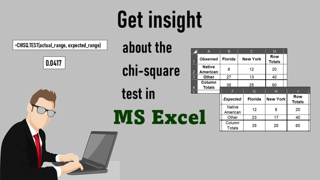
Chi-square test is hard to grasp – but doing it in Microsoft Excel can give you special insight. Read about it on my blog!
11
Oct
Oct
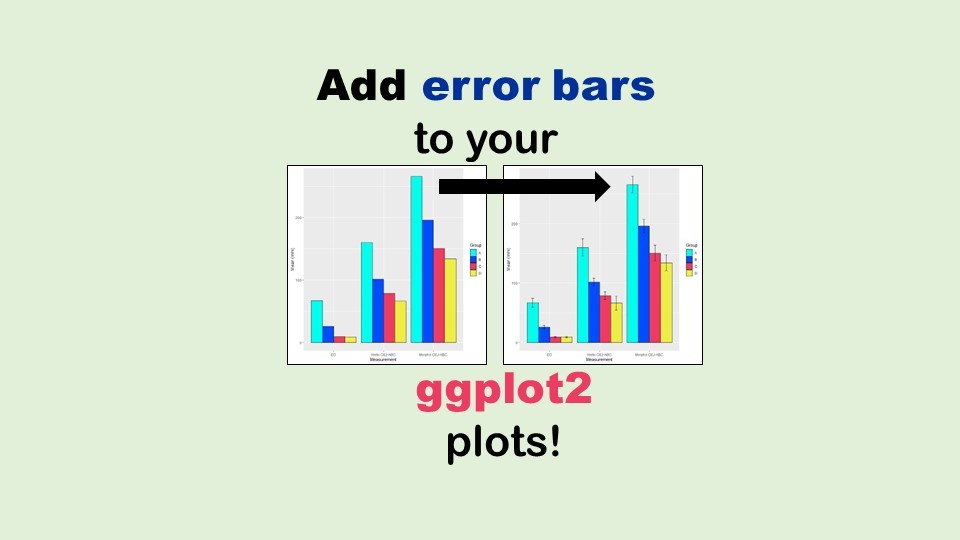
Adding error bars to ggplot2 in R plots is easiest if you include the width of the error bar as a variable in your plot data. Read my blog post to see an example.

11
Apr
Apr
Time series plots in R are totally customizable using the ggplot2 package, and can come out with a look that is clean and sharp. However, you usually end up fighting with formatting the x-axis and other options, and I explain in my blog post.