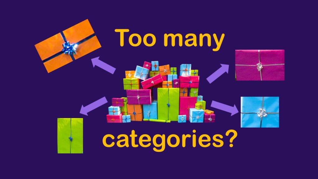
Classification crosswalks are easy to make, and can help you reduce cardinality in categorical variables, making for insightful data science portfolio projects with only descriptive statistics. Read my blog post for guidance!
Tag Archives: data leadership
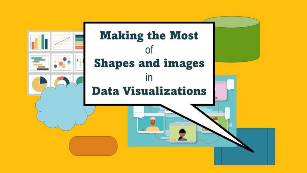
Shapes and images in dataviz, if chosen wisely, can greatly enhance the communicative value of the visualization. Read my blog post for tips in selecting shapes for data visualizations!
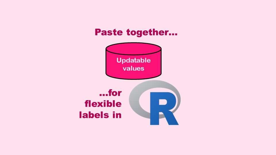
The paste command in R is used to concatenate strings. You can leverage the paste command to make refreshable label objects for reports and plots, as I describe in my blog post.
You may already know that NACCHO is NOT cheese – but what is it? It’s a professional society for local public health officials. Read my blog post to learn what NACCHO does, and who it serves.
Data curation solution that I posted recently with my blog post showing how to do upset plots in R using the UpSetR package was itself kind of a masterpiece. Therefore, I thought I’d dedicate this blog post to explaining how and why I did it.
Read my last post in a series on data-related misconduct at startup Theranos outlined in the book, “Bad Blood”, where I discuss their lack of administrative barrier between research and clinical data.
As a data science leader, what should you put in place so your organization doesn’t end up a data mess like startup Theranos? This blog posts provides guidance.
The Plan-Do-Study-Act model is promoted for quality assurance/quality improvement in healthcare. But does it have any peer-reviewed evidence base behind it? I examine that in this blog post.

