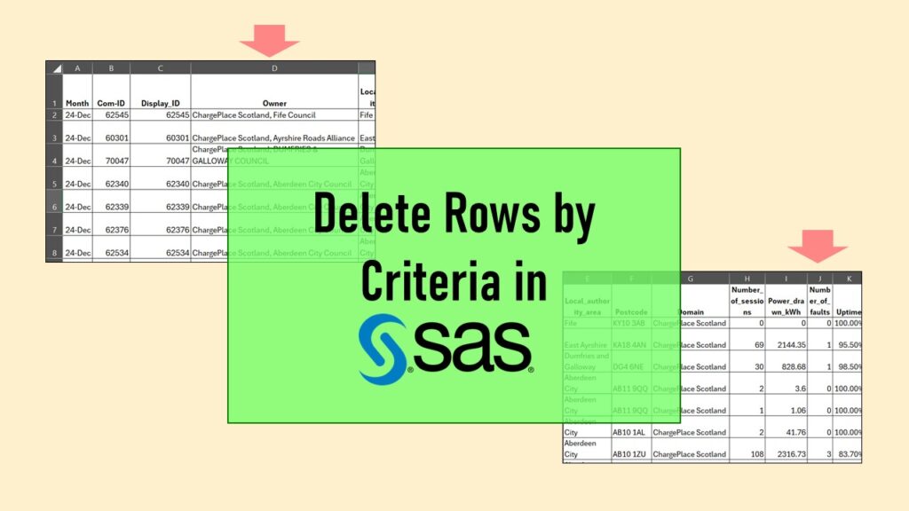
Delete if rows meet a certain criteria is a common approach to paring down a dataset. Read my blog for an example in SAS!
Tag Archives: PowerPoint tips

09
Oct
Oct
Color in visualizations of data curation and other data science documentation can be used to enhance communication – I show you how!
04
Oct
Oct
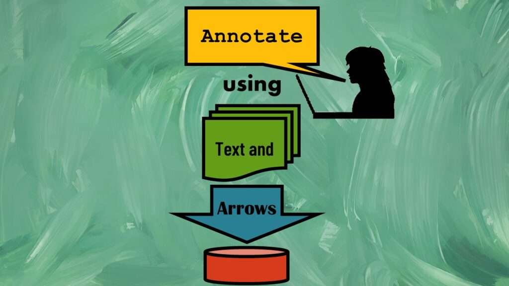
Text and arrows in dataviz, if used wisely, can help your audience understand something very abstract, like a data pipeline. Read my blog post for tips in choosing images for your data visualizations!