While other countries have found a way to control their community spread of COVID-19 while waiting for the vaccine program to be implemented, the United States has totally failed at this. An epicurve is a diagram of the timing of an outbreak, and in other countries, this curve has been flattened. But in the United […]
Tag Archives: data visualization
This lively panel discussed many topics around designing and implementing machine learning pipelines. Two main issues were identified. The first is that you really have to take some time to do exploratory research and define the problem. The second is that you need to also understand the business rules and context behind the data.
SAS is known for big data and data warehousing, but how do you actually design and build a SAS data warehouse or data lake? What datasets do you include? How do you transform them? How do you serve warehouse users? How do you manage your developers? This book has your answers!
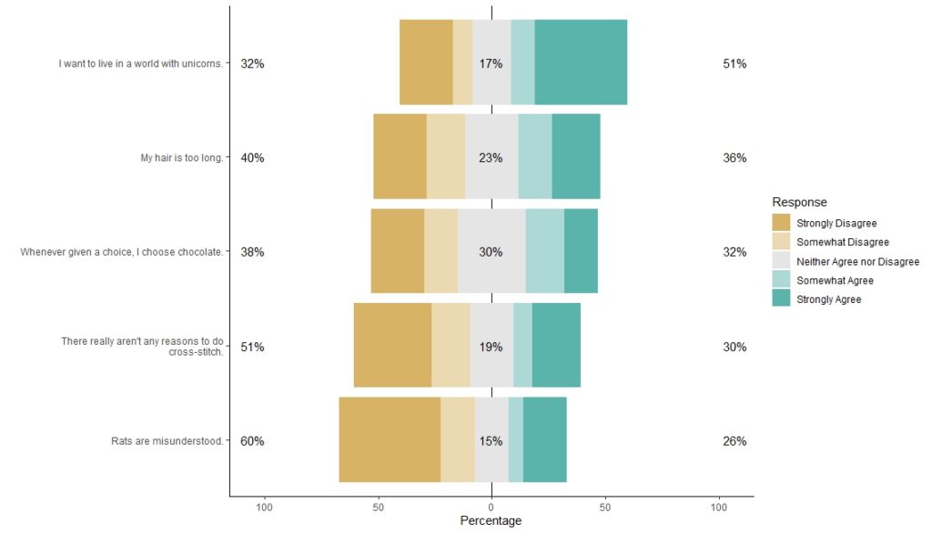
I love the Likert package in R, and use it often to visualize data. The problem is that sometimes, I have sparse data, and this can cause problems with the package. This blog post shows you a workaround, and also, a way to format the final plot that I think looks really great!
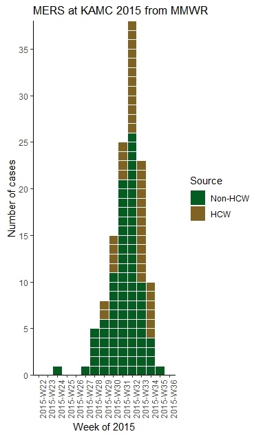
With all this talk about “flattening the curve” of the coronavirus, I thought I would get into the weeds about what curve we are talking about when we say that. We are talking about what’s called an epidemiologic curve, or epicurve for short. And to demonstrate what an epicurve is and what it means, I […]
- 1
- 2