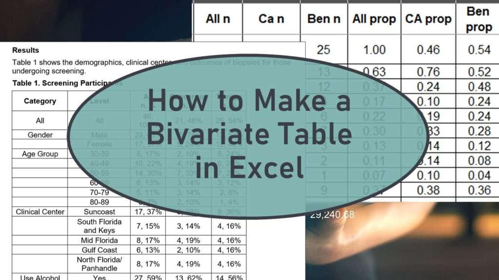
Bivariate table is a term that refers to a table that shows the co-distribution of different pairs of variables. It is a table full of descriptive summaries of the variables in the analytic dataset being used in a research analysis. Another term for a bivariate table is “Table 1” because it is often the first table presented in an analysis.
Analysts make these tables all the time, but I have not seen any “best practices” approach. My online course, “How to Make a Bivariate Table in Excel”, shows you a foolproof strategy for developing an excellent bivariate table for all your data science reports.

14 lessons

0.5 hours of video content

2 case studies

1 challenge with solution

3 chapter quizzes

Cost: $25.00

Ideal Structure of a Bivariate Table
There is no official structure of a bivariate table, so scientific writers are left to come up with their own versions. Here is an example of one version seen in the literature. This snippet of a bivariate table was taken from an observational study on polypharmacy. Polypharmacy refers to the situation where you are overprescribed drugs. Imagine a person with a chronic condition just loaded up with drugs so that they have trouble walking, they are fatigued, and they are slurring their speech. That was the topic of the original study for this bivariate table structure.
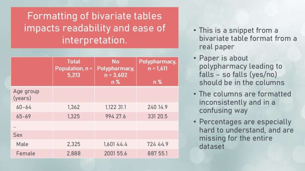
This is one of the examples I show in the course. The researchers had a hypothesis that exposure to polypharmacy increases the likelihood of falls – so falls was the outcome. Therefore, I’m not sure why they put “polypharmacy (yes/no)” on the x-axis, and not “falls (yes/no)”. As you can see in the diagram, the authors also had a confusing way of presenting percentages. There were no overall percentages, and the percentages that were there were hard to read.
In the course, in the introductory lecture, I go over different bivariate structure tables and how they impact interpretation. Then I recommend my best practices approach!

Presenting a Bivariate Table in Excel
When I make a bivariate table, here are the steps I follow:
- I make a table shell in Excel designing what I want to display in my table.
- I generate the frequencies and paste them onto Excel in cells that are not part of my table shell. I also use Excel to generate proportions – or else I calculate these with the frequencies and add them to the sheet that way.
- Using reference code in Excel, I make the frequencies and proportions appear as I want in the table shell.
- Once the table looks the way I want it, I copy it out of Excel into either Word (for a report) or PowerPoint for a presentation.
This graphic shows an example of what I mean.
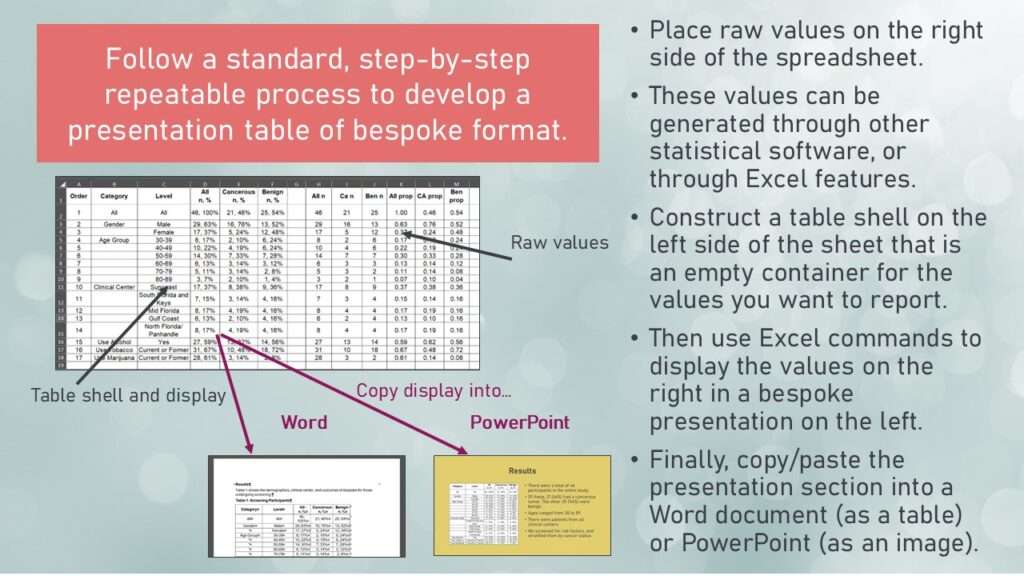
As shown in the graphic, the table shell is on the left side of the Excel sheet, and the raw frequencies and proportions are on the right side. The left side is set up as a display, and once the display is arranged properly, just those cells can be copied out of Excel and pasted into either Word or PowerPoint.

Make a Table of Descriptive Statistics that is Easy to Interpret!
I present a table that I consider “best practices” because it makes it very easy for the reader to understand. Features of my best practices bivariate table include:
- It is easy to tell the total number of participants in the study.
- It is also easy to tell how the participants are distributed in terms of the outcome, as well as the other covariates.
- It is easy to tell how the participants are distributed in terms of these covariates and the outcome (crosstabs).
- Percentages are displayed that aid interpretation, and where the denominators are clear.
- It is easy to adjust how the results are displayed by using coding in Excel.
In the course, I demonstrate how to make one particular format of bivariate table, but I also show alternative formats. My formats deal more with categorical variables, but there are adjustments that can be made for continuous variables. If this sounds interesting to you, please check out the course, “How to Make a Bivariate Table in Excel”. Want to try it for free? Request a free coupon code here.
Try all of our courses and learning programs!

Applications Basics for Data Analysts and Statisticians
Applications basics are now essential knowledge if you want to do data science in healthcare. [...]
3 Comments
Jun

Data Curation Course: Learn Data Curation Online from LinkedIn Learning!
Curation files are especially helpful for communicating about data on teams. Learn more about what [...]
Oct

Data Reduction Diagram Enables Data Scientists to Evaluate Selection Bias
Data reduction diagram is used for evaluating selection bias. If you want to be seen [...]
Apr

Data Science of Data Collection: Free Course and Course Series!
Learn the “data science of data collection” through my free introductory course! If you want [...]
May

Data Close-out Course: Learn How to do Data Close-out Online!
Data close-out course is what you need if you want to combine data from multiple [...]
May

Bivariate Table: How to Make a Descriptive Statistical Summary in Excel
Bivariate table is full descriptive summaries of the variables in the analytic dataset being used [...]
Jun

PowerPoint for Visualizations: A Simple Tool for Minimizing Complexity
PowerPoint for visualizations is an easy choice – but you have to do a lot [...]
Sep

Excel for Managing Research: Learn How to Use Microsoft Excel as a Research Management Tool
Excel for Managing Research is a short, practical course that will give you the skills [...]
May
Bivariate table is full descriptive summaries of the variables in the analytic dataset being used in a research analysis. To learn how to make one, take my online course, “How to Make a Bivariate Table in Excel”.