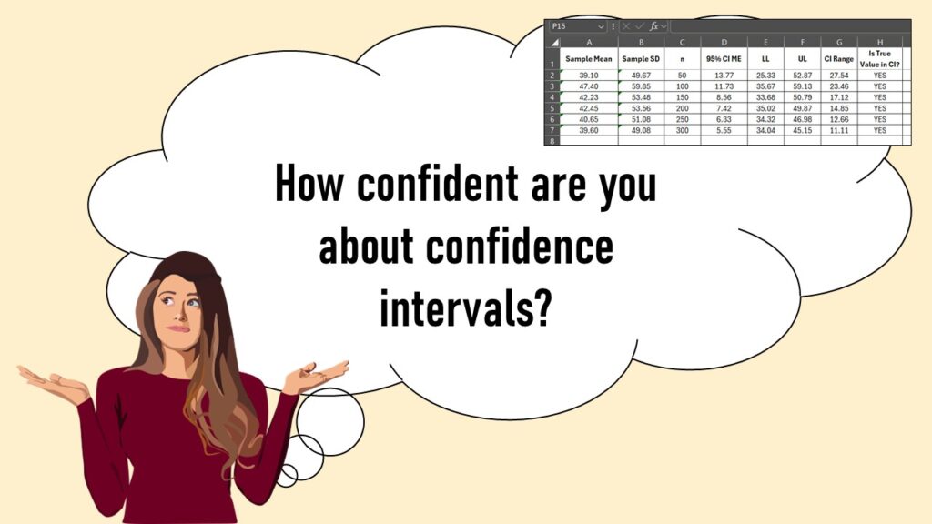
Confidence intervals (CIs) help you get a solid estimate for the true population measure. Read my blog and try my CI calculator!
Tag Archives: dashboard visualizations
26
May
May
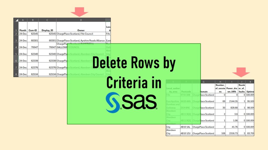
Delete if rows meet a certain criteria is a common approach to paring down a dataset. Read my blog for an example in SAS!
27
Nov
Nov
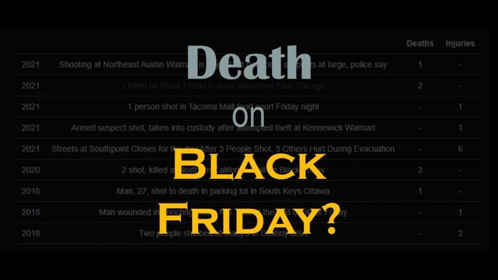
Descriptive analysis of Black Friday Death Count Database provides an example of how creative classification can make a quick and easy data science portfolio project!
01
Oct
Oct
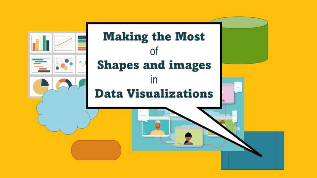
Shapes and images in dataviz, if chosen wisely, can greatly enhance the communicative value of the visualization. Read my blog post for tips in selecting shapes for data visualizations!