
What are the stages of the PDSA model, and how do they relate to the functions of a QA/QI department in healthcare? The answers are not straightforward. I examine these issues in this blog post.

22
Jun
Jun
If you are not sure if you will like doing research in healthcare, instead of starting with big data, start with data collection and get to know the data as it comes into the dataset.
21
Jun
Jun
Monika posts her “data science newbie do-it-yourself starter kit”, with links to cheap or free learning resources for the data science newbie who wants to get started in healthcare analytics.
Quality Assurance/Quality Improvement (QA/QI)
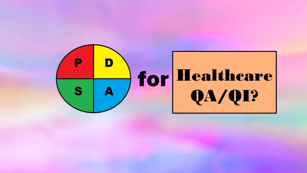
Quality Improvement in Healthcare: What is the PDSA Model, and How Well Does it Work for QA/QI? Part 1 of 5
16
Jun
Jun
Wondering what the Plan-Do-Study-Act (PDSA) Model is, and if you should adopt it for quality improvement in healthcare? Read my series of blog posts on the subject for my personal experience and recommendations
Quality Assurance/Quality Improvement (QA/QI)
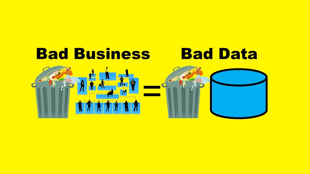
“Bad Blood” Reveals Theranos was Guilty of Bad Business and Bad Data Science: Part 1 of 5
14
Jun
Jun
This is my first blog post in a series of five where I talk about data-related misconduct outlined in the book “Bad Blood”, and provide guidance on how to prevent it.

15
Dec
Dec
We experience artificial intelligence all the time on the internet in terms of friend suggestions on social media, internet ads that reflect what we have been searching for, and “smart” recommendations from online stores. But the reality is that even the people who build those formulas cannot usually explain why you were shown a certain […]

05
Dec
Dec
Lipedema, a severe metabolic disorder, is more common than originally thought. A non-trivial proportion of women who struggle with obesity actually have undiagnosed lipedema. I am on a research team that just published a peer-reviewed article that presents the ketogenic hypothesis for lipedema, and here, I present a summary.
Career Development
Two Takeaways from Danny Ma’s Machine Learning Panel: Understanding the Problem, and Understanding your Data

04
Dec
Dec
This lively panel discussed many topics around designing and implementing machine learning pipelines. Two main issues were identified. The first is that you really have to take some time to do exploratory research and define the problem. The second is that you need to also understand the business rules and context behind the data.

28
Nov
Nov
On #GivingTuesday, donate to Central Boston Elder Services’ Little Necessities program! Give early on December 1, 2020, and your donation may be matched through a program arranged by the #GIVE65 senior services crowdfunding platform.
26
Nov
Nov
Get to know three of my favorite SAS documentation pages: the one with sort order, the one that lists all the SAS formats, and the one that explains all the SAS operators and expressions!