
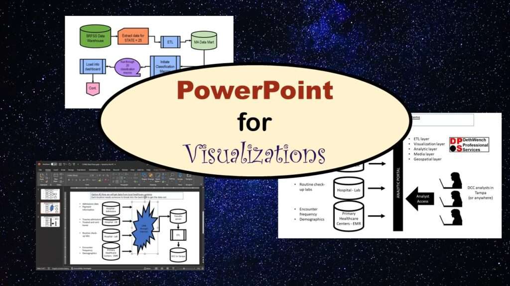
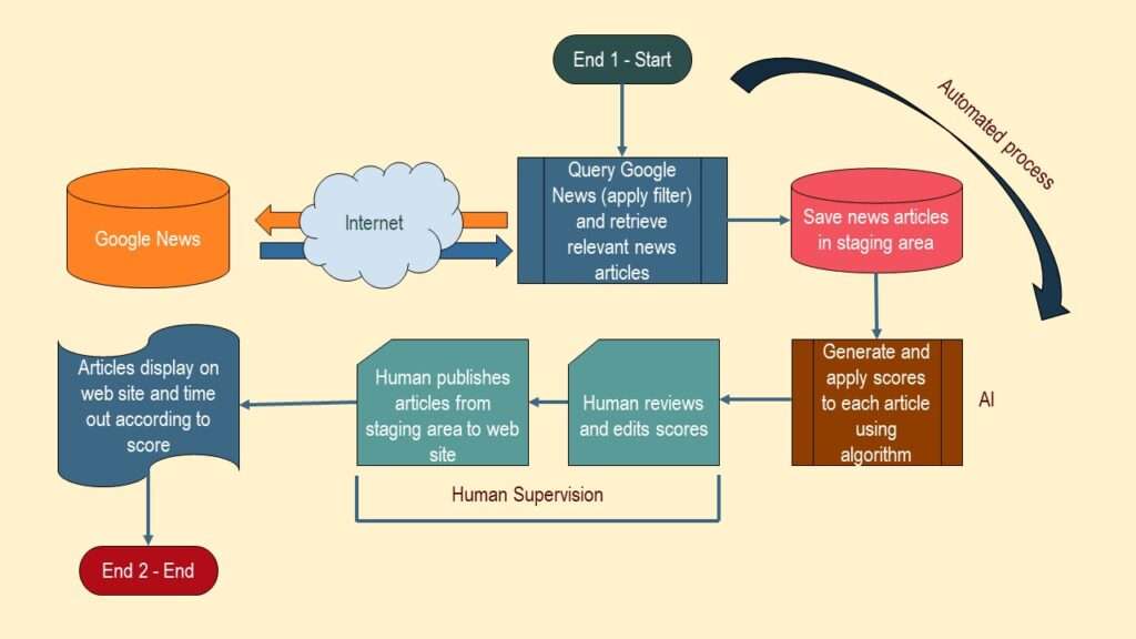
Download the slides from the presentations here.
Using Flow Chart Shapes for Communication
Download slides
Setting Defaults in PowerPoint
Download slides
Navigation Tricks in PowerPoint
Download slidesCheck out my courses and books!
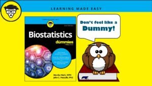
Biostatistics for Dummies: The Thinking Data Scientist’s Quintessential Professional Reference
“Biostatistics for Dummies” is the thinking data scientist’s essential reference. Check out the updated 2024 [...]
Sep
Data Curation Course: Learn Data Curation Online from LinkedIn Learning!
Curation files are especially helpful for communicating about data on teams. Learn more about what [...]
Oct

Study Design Courses: Online Learning about Research Methods
Study design courses that you can access online will hand you a framework for research [...]
Sep

Learn R Online: Take it at Your Own Pace
Learn R online and tackle statistical problems easily with open source software! Take my LinkedIn [...]
2 Comments
Sep
Announcing the Publication of my New SAS Book on Data Warehousing
SAS is known for big data and data warehousing, but how do you actually design [...]
Oct

Learn SAS Online, and Expand your Career Opportunities
Learn SAS online, and extend your expertise so you can take on new projects. Take [...]
Sep

Testimonials for Monika Wahi’s Linked In Data Science Courses
Testimonials for Monika Wahi’s data science courses on LinkedIn Learning are posted here. Read what [...]
Apr
